
Facebook Cover Photo Size: Make One Cover Work Everywhere
The recommended Facebook cover photo size is only the starting point. Learn how cropping, profile overlap, safe areas, file formats, and live-device checks shape a polished Page.
Your Facebook Page can look polished on a laptop and mildly kidnapped on a phone. Missing headline. Half a face. Logo hiding behind the profile picture.
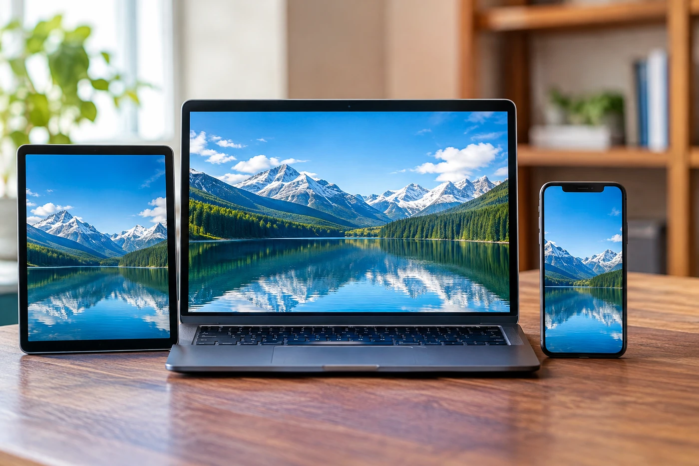
That isn't necessarily bad design. Facebook is asking one image to survive three different shapes.
One image, three shapes
As of October 12, 2026, Meta's guidance1 recommends uploading Page covers at 851 × 315 pixels. The minimum accepted size is 400 × 150.
Simple enough. Except Facebook says the image appears in a 16:9 frame on computers and a much wider 2.4:1 frame on mobile. The recommended upload itself is roughly 2.7:1.
So no, there isn't a magic size that looks identical everywhere. Facebook resizes and crops the file, aligns it left, then places your profile picture over part of that left side. On mobile, the overlap is around 40 pixels.
Meta recommends an sRGB JPG under 100 KB for faster loading. If your design contains lettering or a logo, PNG may stay cleaner.
The pixel size isn't the real rule. The real rule is: don't put anything valuable near the edges.
Your quiet landing page
A cover photo won't rescue weak posts or charm the algorithm. It matters after someone clicks your name, though. That makes it part billboard, part trust check.
And Facebook isn't exactly an abandoned shopping mall. Meta reported 3.60 billion daily active people across Facebook, Instagram, Messenger and WhatsApp in June 2026, while ad impressions rose 14% year over year. Those are family-wide numbers, not Facebook-only, but they explain why an untidy Page still costs creators real opportunities. The figures sit in Meta's second-quarter results2.
This cropping headache also isn't uniquely Meta's. YouTube uses one banner across televisions, computers and phones, recommending 2560 × 1440 pixels with a much smaller safe area for text. Its official banner guide3 openly warns that different devices will crop the same image.
Fix yours today
Open an 851 × 315 canvas and treat the outer edges as scenery. Keep your face, logo and short message near the center. Leave the lower-left area boring so the profile picture can sit there without eating your sales pitch.
Give the cover one job. Say what you make, announce the current launch, show the product, or tell people when you publish. Trying to fit your biography, mission and three links up there is how banners become tiny ransom notes.
Export a PNG when text matters; use a compressed sRGB JPG for photography. Then check the live Page on both desktop and the Facebook app. Not just the preview tool. The live Page.
Finally, set a reminder to inspect it every quarter. An expired event date above an active creator account sends a very specific message: nobody's minding the shop.
- 1facebook.comMeta's guidance
- 2investor.atmeta.comMeta's second-quarter results
- 3support.google.comofficial banner guide
Discussion
Join the discussion - share what's working for your channel.